Line chart
Line chart:
In this step, we’ll create a line chart using the autograph feature, and try adding predictive metrics using QuickSight’s Forecast feature.
Content
Sales chart by month
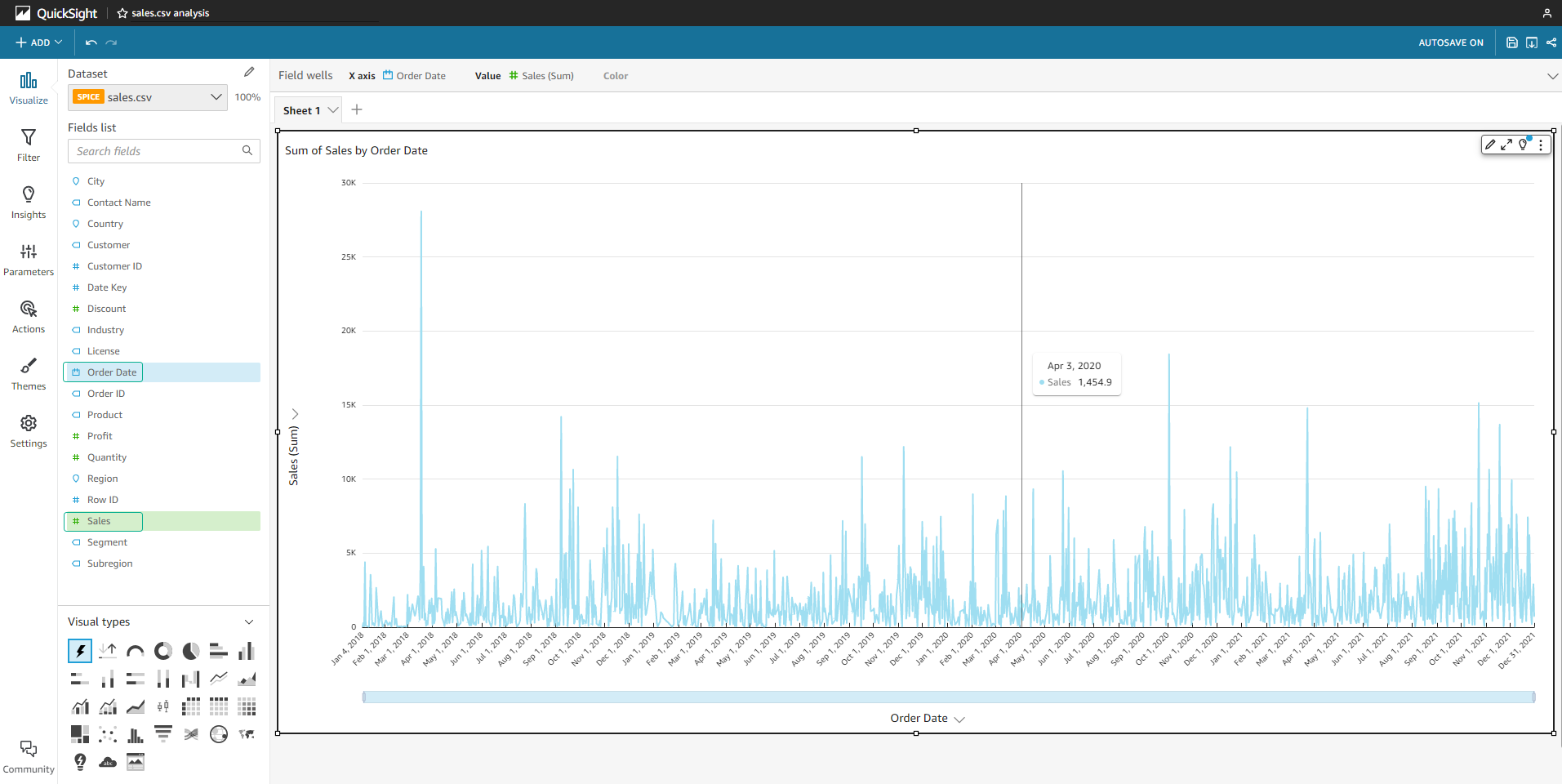
- In the Fields list, select Sales then Order Date.
- We will see the autograph chart automatically generates the total Sales chart by day.
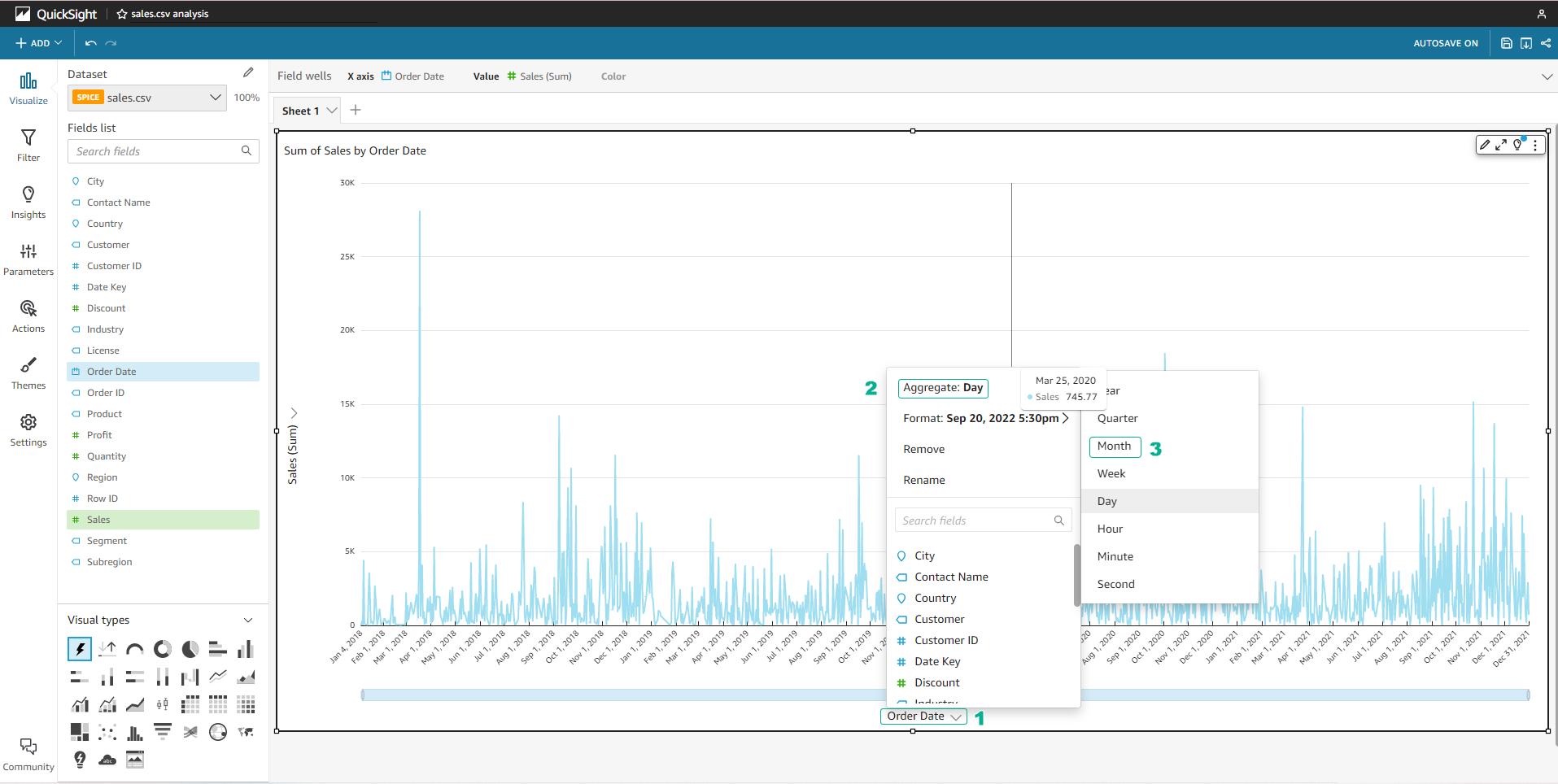
- Select the arrow next to Order Date > Aggregate: Day > Month to convert the unit to months.
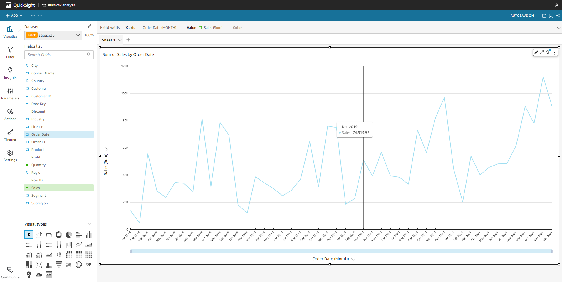
- We will see the chart converted to total Sales by month as shown below.
Add future prediction data
Predictions are generated from datasets and QuickSight’s Machine Learning model. Take the following steps to apply predictions to the chart:
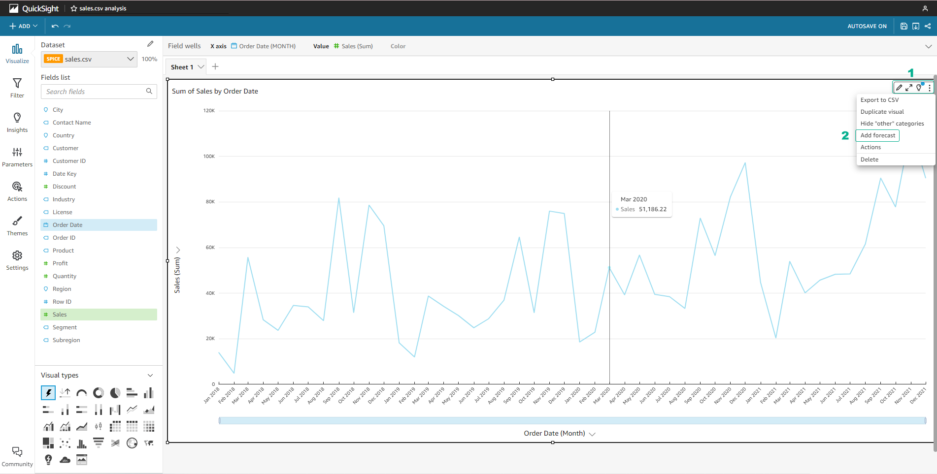
- Make sure your chart is active by clicking inside the chart.
- Click the … icon in the right corner of the chart, and select Add Forecast.
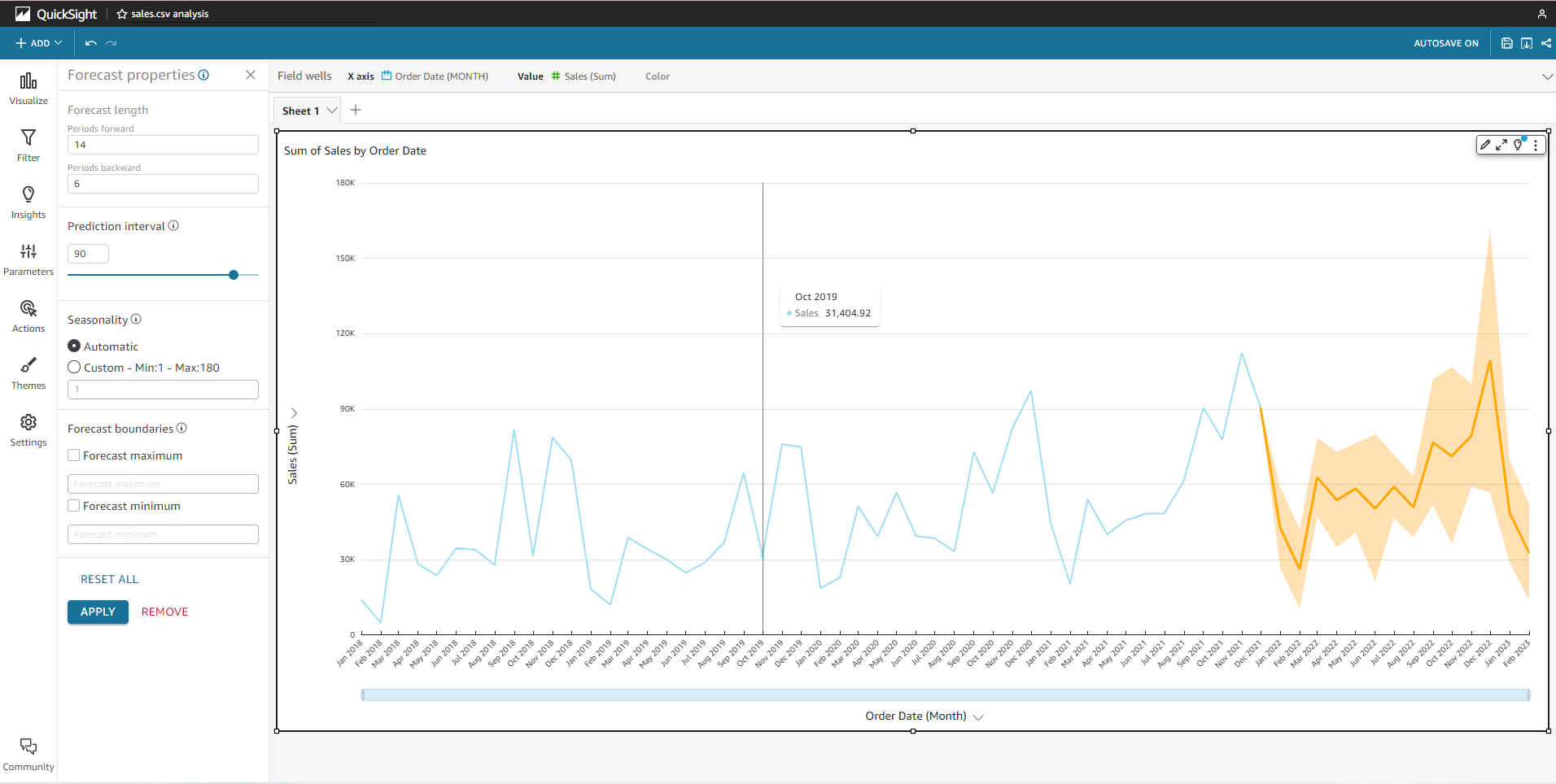
- In the Periods backward section, enter 6.
- Click Apply.
- The prediction line shows the data from 6 months ago so that we can compare it with the actual data in the Dataset.
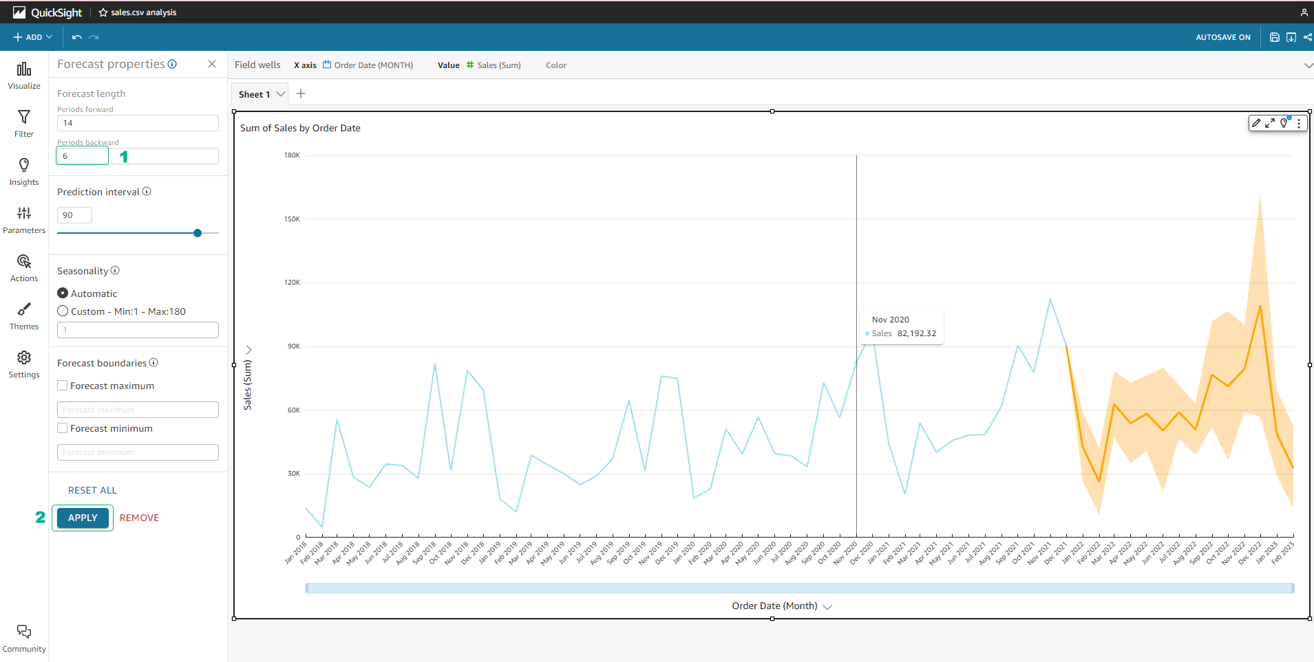
- We can hover over the line chart to check the Forecast value and the actual value.
Next, we will create a KPI chart and use QuickSight’s Insights feature.